Kitchen 104 (08.10.2021)

When designing kitchens, I start by understanding your preferences and the unique features of your space—plumbing, ventilation, windows, and doors. I then blend these with the principles of exceptional kitchen design, applying my practical expertise and creative vision to craft a kitchen that is both beautiful and highly functional.
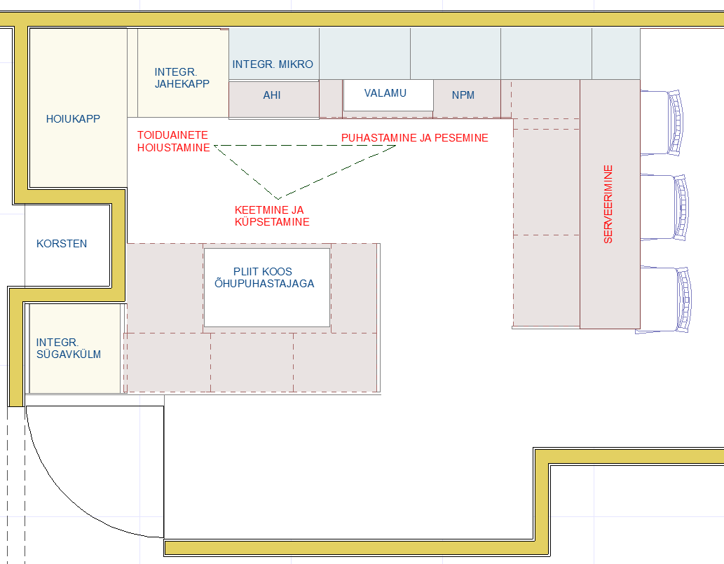
Working triangle
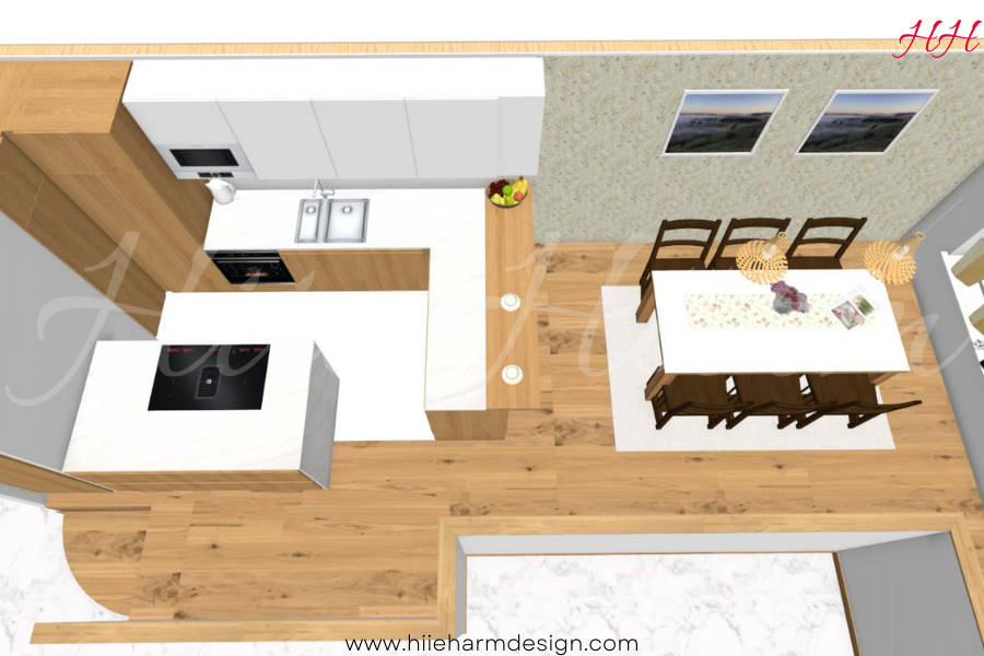
The primary backbone of a comfortable and practical kitchen is the master plan, zones, and movement path, ie the work triangle. There must be a free working area next to or near the refrigerator to support the shopping bag or to store food taken from the refrigerator. There must also be a free work surface on both sides of the hob and sink.
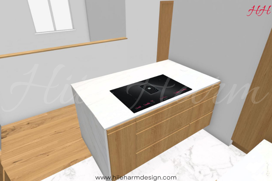
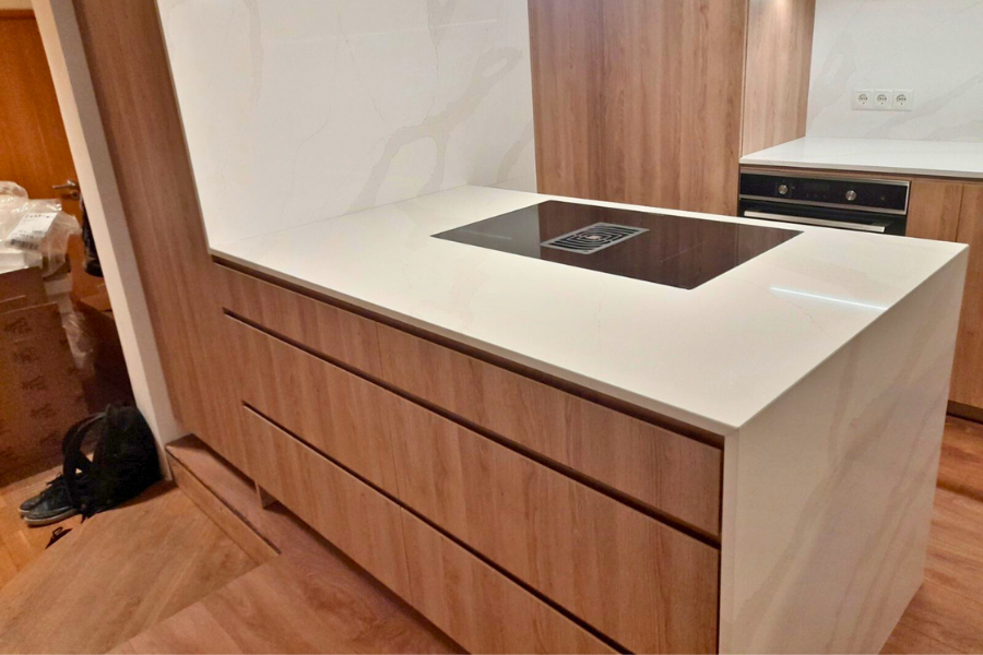
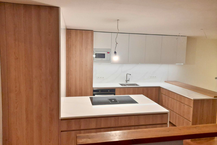
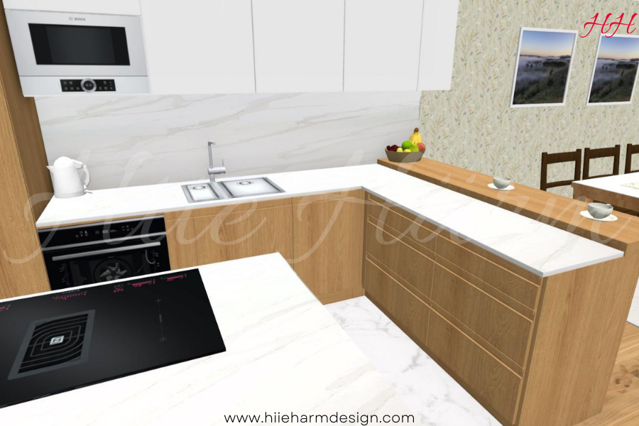
In the case of this kitchen, the dimensions and possibilities of the room had to be taken into account. The nish in the kitchen corner, the part of the dining room in the direction of the window and the customers’ wish to place the stove on the peninsula had to be taken into account.
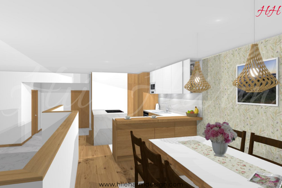
It takes a little getting used to the fact that the refrigerator is in the back corner. At the same time, the work triangle is beautifully in place again and there is room for several cooks. There is free workspace everywhere next to the refrigerator and sink and stove.
Description of the kitchen structure
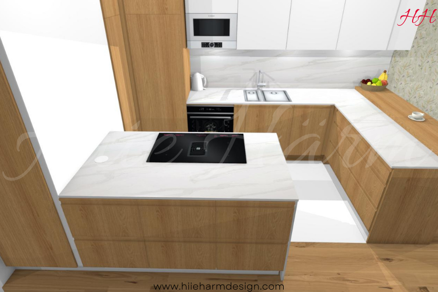
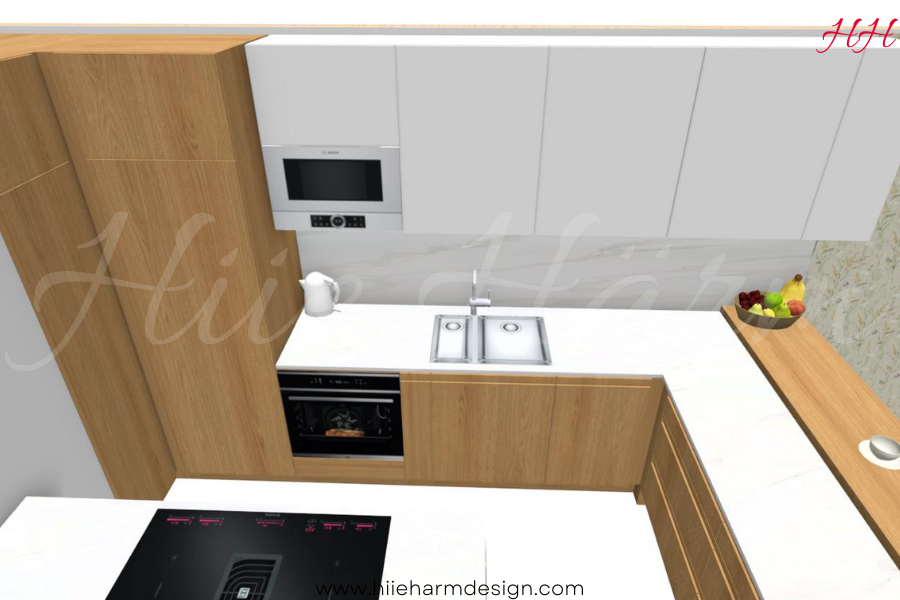
Next to the chimney in the rear niche is a high blind corner cabinet. The dimensions of this niche dictated which corner system could be placed in it. I have seen in American kitchens, for example, to put 4-5 corner systems of Le Mans on top of each other. This is also done in this kitchen design.
The next high cabinet is a fully integrated refrigerator. The built-in high freezer is in the corner as soon as you enter the kitchen. The family there is used to using it before on that location. When you come to the store, you can immediately put the bags on the kitchen island and then walk to the other side of the island and then store things in the refrigerator.
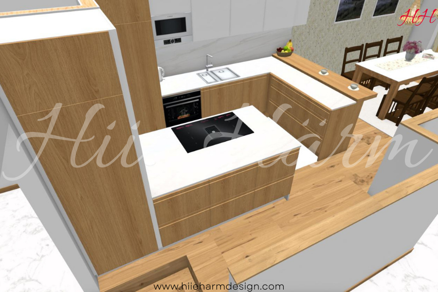
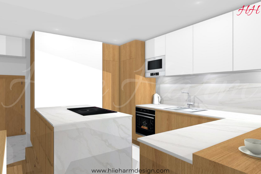
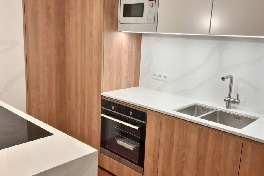
There is an oven next to the refrigerator because it could not fit under the stove, because the stove has a built-in kitchen hood. There are large drawers down there. The oven and microwave in near are also perfectly suitable. The kitchen island is also nearby. You can also place the oven plate on top of it immediately.
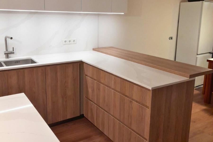
The customer wanted a large (thick) bar counter standing on kitchen cabinets. I often put a cupboard in the corner, which is facing the room instead. This way I avoid the extra corner cabinet and I can use the drawers on the kitchen side instead.
Style
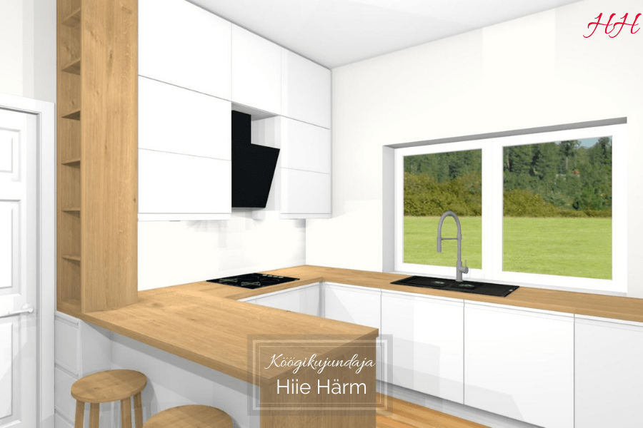
It is wise to use a maximum of three different colors. In the case of this kitchen, it is white, as white adds space to a small space; warm natural oak, as the room already has elements of oak and the doors in the field of vision are also made of oak.
The third color can be considered light gray, as both the work surface, the side of the island, and the background have a modern marble pattern. Or green, if the family embraces the green wallpaper I have proposed because greenery shines through the windows and a lot of green flowers grow on the windowsills.
360 panoramic view
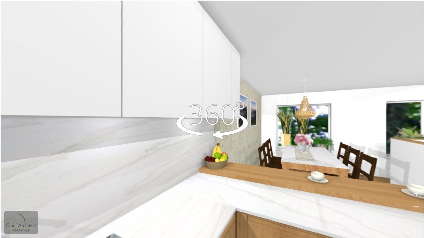
Click on the picture to explore a panoramic view of this kitchen. Simply hold down the left mouse button and move it slightly up and down to find the best angle for a closer look.
Real Kitchen Pictures
Related projects
Kitchen 126 (11.05.2021)
Grey kitchen, Modern kitchen, PortfoolioKitchen 101 (28.09.2021)
Grey kitchen, Modern kitchen, PortfoolioKitchen 58 (17.07.2020)
Modern kitchen, Portfoolio, White kitchen
Let me design a beautiful kitchen for you too!
Check out the packages and prices on the e-Design Services page!


